Oops! We Did It Again: We Forgot About UX Writing


5 min read

UX writing is the neglected child of design. And yet, it’s becoming an increasingly important strategic differentiator — and a key factor in product resilience.
Let whoever has never encountered (or even written) this kind of error message cast the first stone:
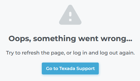
Just one example among thousands of things that have apparently “gone wrong” somewhere in the world.
“So what? What’s the problem? Users don’t read anyway,” some might argue.
Well.
A significant part of our interfaces consists of text, and we design them on the assumption that users can read.
The least we could do is make sure that what they’re reading actually means something.
Here, the message is neither explanatory, factual, nor even empathetic. It simply shifts the burden of resolving the issue onto the customer, at the worst possible moment.
(Not that there’s ever a good moment.)
After my first reaction — which, naturally, involved a bit of trolling and christening this particular kind of microcopy “a Britney” — I started wondering:
How on earth did we get here?
Lazy benchmarking? Trying too hard to sound cool? A complete disregard for language as an interface? Some bizarre cocktail of cognitive myths about “users, those mystical creatures everyone claims to understand”?
Whatever the answer, somewhere in the world, as you’re reading this sentence, someone is staring at that exact error message after losing a customer, a database, or fifteen minutes of their life.
All because we’d rather write “Oops” than take the time to design content as a fundamental part of the user experience.
Why are error messages (still) designed from a purely technical perspective?
Error messages originate in engineering, not in experience design.
They’re written for developers.
Historically, an error message is a technical artifact: a warning light that switches on when something goes wrong in the system.
And since the system can no longer deliver what the user came for, someone has to tell them that something needs to happen before they can move forward.
Possibly something they need to do themselves.
Although, you know, it might help to actually tell them what.
Error messages were designed to diagnose, not reassure. To log, not explain.
So, naturally, we ended up producing messages that sound exactly like logs.
And never mind the person on the other side.
Someone who might be:
Panicking.
Losing hours of work.
Watching their production workflow grind to a halt.
Wondering whether their business is about to take a serious hit.
Between the system’s intention (“I crashed”) and the human’s intention (“Help me understand what’s happening and how to get out of this”), there is absolutely no alignment.
And this disconnect isn’t new.
It’s a legacy of a time when text wasn’t considered an interface, but rather a dumping ground for internal information. A time when text was primarily used to record, report, or archive.
So we log things.
And then we reassure ourselves about the quality of our user experience by adding a playful little:
“Oops!”
A word that serves absolutely no logical or emotional purpose, except to announce to the world that…
Well, yes.
Something broke.
Except nobody is surprised when software breaks anymore.
What’s surprising (and exhausting) is that the way we communicate about it hasn’t evolved in twenty years.
Okay. We’ve complained enough. What do we actually do about it?

Put a pilot back in the cockpit? (Sorry. Couldn’t resist. It’s a Britney moment.)
We start by caring about our users and the journey they’re going through when we write for them.
Even today, surprisingly few teams ask themselves these basic questions:
What is the user losing at this exact moment?
What’s the right tone to support them through it?
Based on what they’re feeling first, and your brand positioning second.
How much detail do they actually need?
What factual information can I provide without making things up?
(Yes, please. For the love of everything, stop treating your users like idiots.)
What simple action can I offer without shifting the burden onto them?
Because your users already live in an enshittified web where they’re doing unpaid work for your SaaS, your competitor’s SaaS, government websites, and every platform under the sun.
Ideally, we shouldn’t make things worse.
Or at least, not much worse.
In other words, we need to consider:
The criticality of the moment, the user’s emotional state, the nature of the failure, and the psychological and functional needs that must be addressed.
From random error messages to a proper UX writing framework
I tried putting these questions into a matrix, inspired by an approach used by a former colleague at Leboncoin (who eventually became a UX writer).
Map your messages.
Build your matrices using user empathy maps.
And watch the quality of your error messages improve.
Along with your product’s usability.
It’s worth remembering that the quality of error messages is one of the usability criteria identified by Bastien and Scapin, even if other frameworks have since reshuffled the deck.
And, on a much more pragmatic level, adopting this approach can help you:
Reduce churn.
Decrease support tickets.
Improve journey completion rates.
Strengthen perceived product quality.
Because if you’ve already built a product that “works”, but certain critical moments still break the experience…
That’s probably where you should start looking.


